Blog: Top 5 Seattle Logos

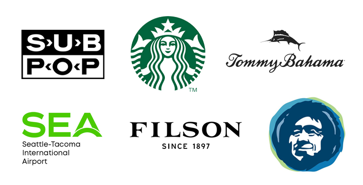
Seattle is known for many high profile companies including Starbucks, Microsoft, Amazon, and Boeing (since moved). While Seattle is full of many smaller companies with great logos I felt for this exercise, I’d only rank large, nationally known companies (excluding sports teams which are their own thing) that are familiar to the widest audience. That being said, these are my top 5 Seattle logos.
Starbucks
As a long time Seattle Supersonics fan it pains me to admit that the Starbucks logo is really well done (since Starbuck’s owner sold the team down the road and they moved to Oklahoma City). But as far as design goes there is no debating this is a really well done, solid design. Well recognized and reads both as a small icon and for signage.
Sub Pop
So iconic as a part of one of the greatest music revolutions in recent memory. The bold logo is clear, utilitarian, and in keeping with the no nonsense music. Black and white adds to the underground feel and arrow forms give just the right amount of style to the mark.
Filson
Hand crafted serif type seems perfectly in keeping with the company’s rugged but high end line. Addition of the year founded gives balance and creates a nice dynamic.
Alaska Airlines
Face icon is well known and looks great in their rebrand. Colors are bright and welcoming while remaining quintessentially Pacific Northwest. Refined logotype is an improvement but the overall brand/colors make it a top area look.
Tommy Bahama
Funny that this is, yes, a Seattle company. But they do a great job of capturing the island feel with the script and fish icon. Feels like a vacation and hits its mark.
Honorable Mention - Seatac Airport
Although not in Seattle I’m including this since anyone flying into Seattle comes through this airport south of town. Simple and clean I absolutely love the arc on the A which signifies in my mind the take off and landing of an airplane. The bright green is the perfect color for an airport in the Emerald City.
— Hovie Hawk
< Back to Blog
