Blog: A Graphic Designer in Milan
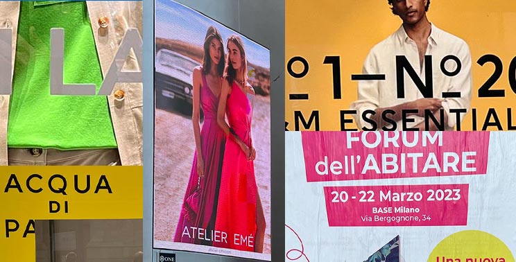
One thing that is so cool about being a graphic designer in Milan is getting a first look at the styles that will be finding their way to the rest of the world over the coming year. Although the looks are heavily based in fashion, the colors, fonts, and layouts of the fashion material can dictate what’s next for graphic design as well. Recently I was back in Milan to refresh my senses and catch up with old colleagues. What did I see? Bright, bold neons and bursts of color that reminded me of the looks I grew up with at Art School in the 80s. The energy was palatable and really got me excited to see how I could incorporate it into my work.
How and when to incorporate those new looks though is an interesting designer’s dilemma. Even when creating work for adventurous tech companies in Seattle, there can still be a hesitation to embrace looks so new. Sure technology has allowed us to speed up design’s migration process but seeing something in a social media feed vs seeing it daily all around you in your neighborhood is a very different experience. It needs time to gradually infiltrate a local society and become accepted.
Whether you’re simply walking to the bus or metro stop, going to the grocery store, or heading out to dinner in Milan, you can’t help but be bombarded with great design at every glance. In addition to the inspiring store window displays, one sees well designed band posters on light poles, finely crafted menus and interiors in mom and pop trattorias, and of course the occasional Ferrari cruising by. Designing well is something ingrained in the Milanese and Italian culture and I hope to continue to be fortunate enough to regularly visit to keep on top of what’s new, fresh and exciting according to the icons of the fashion world.
— Hovie Hawk
< Back to Blog