Blog: Logo Trends 2024
Over the past year or so we’ve seen a pretty consistent move to simplify brands and logos. They are becoming less crafted and more bold, but generic. I feel a big reason for this is the continued rise of social media of all types. Your logo needs to show up well in a small square or circular icon. Whereas in years past you could appreciate the integrate design work of a logo whether it be on a store sign, hang tag, or business card, today a majority of people only see the logo in pixels and often only on a small phone screen. Whereas I can appreciate the need for a logo to pop at 50 pixels, I fear we may be going a bit too far in the simplified direction.
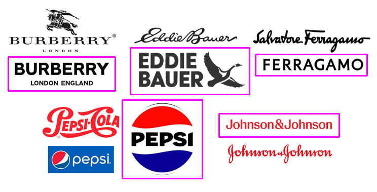
Take the new logos for brands like Eddie Bauer, Salvatore Ferragamo, and Burberry. To a non-designer these are nearly identical, big, thick, type treatments. They’ve went from very distinctive brand logos to almost a generic version. Johnson & Johnson uses a lighter weight but went from a very nicely crafted script to a generic sans serif too (although I’ve read the reason for this was that younger people can’t read script). Then there’s Pepsi. They’ve gone back to an older bold look (were they ahead of their time?) but when you see the finely done script logo of their past, the new one seems like a downgrade.
Logos and brands ebb and flow and I’m sure after 50% of the companies all have big bold sans serif typefaces we’ll see a return to a more crafted look. What’s shocking to me though is how many really big brands so quickly jumped on the bold bandwagon. When an icon like Salvatore Ferragamo loses their distinctive script, maybe it’s time to take a step back and reassess just what a logo is meant to be.
— Hovie Hawk
< Back to Blog